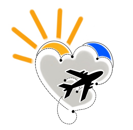
In case you were wondering, I thought it would be interesting to share the story behind my logo for this website. I did not use a web designer, nor a graphic artist. Instead, I asked a tattoo artist named Matt to help design my logo. More than once I have been asked why I would hire a tattoo artist. Firstly, I love the designs and style of tattoos, which have a unique flow and complexity. And most importantly, Matt did two of my tattoos at Evil from the Needle in Camden, London. So, the design has a personal meaning and link for me.
I had met Matt only twice before, when I decided to ask if he would like to take on this project. Luckily he said yes! He had done two tattoos for me previously and was wonderfully calm, kind and talented. Another part of my motivation was to try to help people during the covid-19 lockdown who I knew were unable to do their normal work. Unfortunately, all of the tattoo parlours were closed for much of the covid-19 pandemic. Therefore, it seemed a great idea to ask him if he could do this work, and for me to benefit from his artistic talents!
To start with, Matt asked me to give him some ideas about the logo and my website. I must admit I was quite vague at the start! I think I came out with something related to a plane and brain clouds. We started throwing some general ideas around. Then he made a virtual mood board. That was a very cool step to experience part of his creative process. Next he made some sketches and I chose my preferred ones. Then we made refinements until we got to a set of final images. For example, there were different colour schemes and varying types of “flight paths”. It was a difficult choice because I liked more than one of the designs. Perhaps some of the others will pop up later! And the one you can see as my main logo was my favourite of them all.
First, there are some obvious links to my love of travel. These include the heart and the plane flying above the clouds. I also liked the idea of having sunshine and blue skies, even just a small slice of blue. These are to represent optimism and positivity. And I love how Matt made the little dots along the flight path to symbolise destinations. That adds an element of dynamism to the image. Most importantly, I was really pleased with the way the icon embodied the concept of world travel without showing a globe.
Thank you so much Matt for your creative genius! I love the designs and hope to use them more over time.
